Yodawy ● Feb 15, 2022
Yodawy Announces New Brand Identity

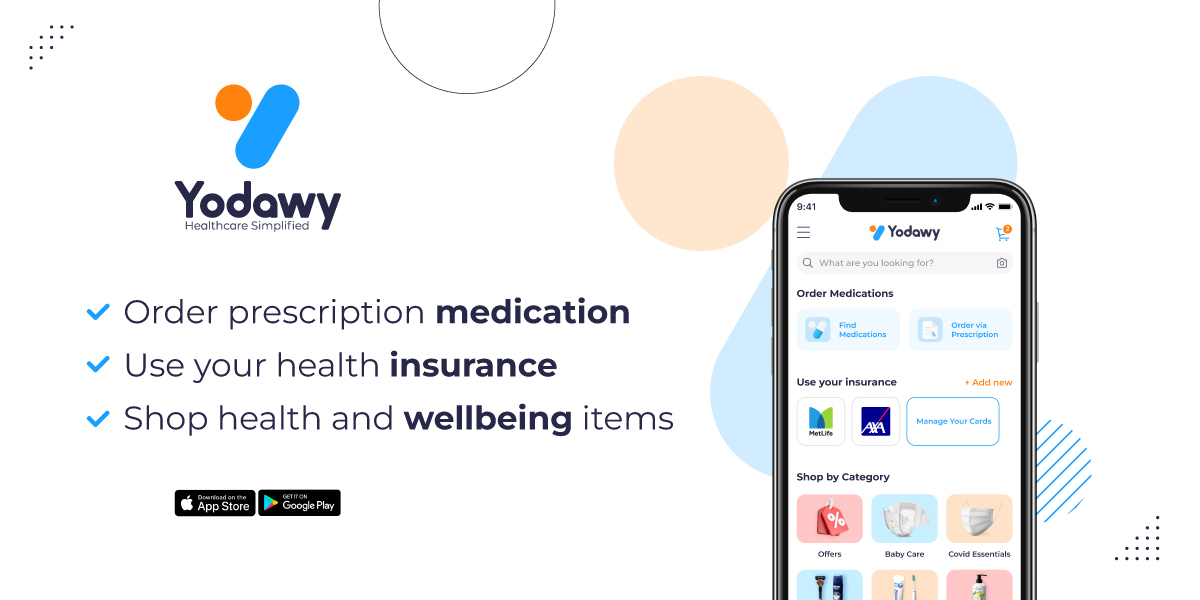
Over the last few months, we have poured our hearts and minds into creating our new branding that reflects Yodawy’s evolution since the company’s founding in 2018. So today, we are thrilled to be sharing with you Yodawy’s new brand identity.

Challange We needed to come up with a new brand identity and symbol that would reflect the positive transformation already happening across Yodawy. The new brand needed to bring together the patient care products and services we offer our customers and partners under one single identity. It also needed to represent Yodawy’s journey in redesigning the way simplified access to medication should be.

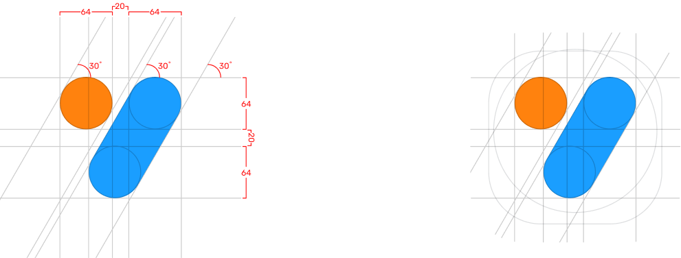
Solution We built an all-embracing visual identity that unified Yodawy’s offerings and that brings to focus our mission of providing a simpler and easier way to access medication designed around our customers’ and their families’ needs. The Yodawy symbol expresses what we are about as a brand - it is made-up of two shapes of medication which together form a heart symbol. It also refers to the first letter of our brand name - Y for Yodawy.

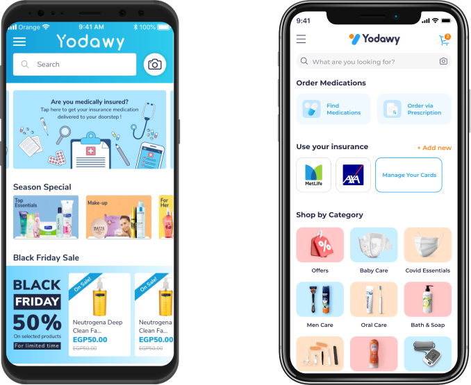
While this marks a significant change, our commitment remains to empower individuals to take control of their health by providing a hassle-free ordering experience through the use of our technology solutions and our personalized approach to customer care. At Yodawy, patient care is at the center of everything we do. So we've updated our logo to better reflect our promise to continuously deliver an effortless experience to our users and partners.

We’d like to take this opportunity to thank you; our loyal users and partners for your ongoing trust in Yodawy. As we roll out Yodawy’s new brand changes, feel free to connect with us on social media and reach out with any thoughts or just to say hello!
